Visualizations can provide insight and convey meaning for data. It may be useful to create visualizations to spot trends, outliers, and make the data easier to interpret.
Step 1: What is the purpose of the visualization?
- Do we need to compare one item to one or more other items?
- Find the Highest/Lowest value points
- Show change over time
- Do we need to show the breakdown of th data?
- Does the breakdown change over time?
- Do we need to show how the data is distributed over a certain range?
- Emphasize groups within data
- Emphasizing outliers in the data
- Do we need to show a relationship between two or more variables?
- Positive or negative relationship?
- Strong or Weak Correlation?
## Step 2: Determine the types of Data -Numerical data: Numbers that are either discrete or continuous - Discrete: Integers - Ex: Counting units sold - Continuous: Real Numbers - Ex: Temperatures, Revenues
- Categorical Data: Ordinal or nominal values
- Ordinal Data: Data with an understood ordering of values
- Ex: Days of the week, alphabet
- Nominal Data: No understood ordering of values
- Ex: Countries, genders
- Ordinal Data: Data with an understood ordering of values
## Step 3: Choose the chart type
- Comparison
- Compare items against each other or over time
- Bar plots, Scatter Plots
- Composition
- How parts make up a whole
- How composition changes over time
- Pie Chart, Compositional Bar Plots
- Distribution
- How the data samples are spread out over one or two variables
- For Clusters and Outliers
- Relationship
- Correlation between two or more variables
- See trends in data
- Scatter Plot with Trendlines
Comparison Charts
Column Charts
- Good at showing numerical values for categorical data
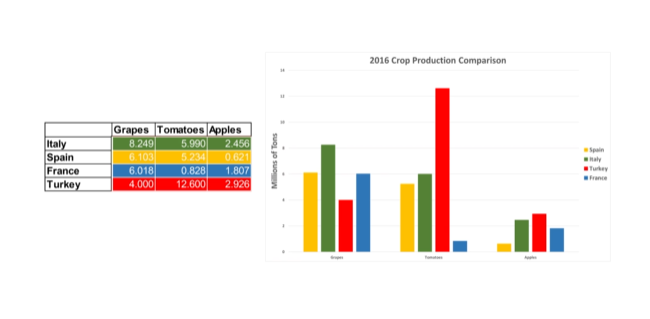
- For example, a table with categories of crops and their respective heights
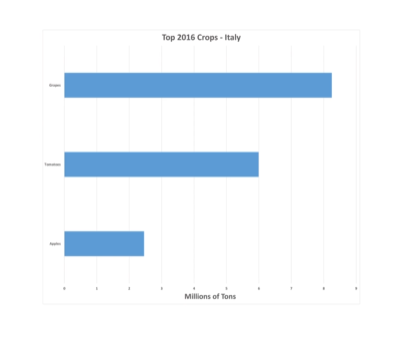
Bar Charts
- Turn a column chart on its side
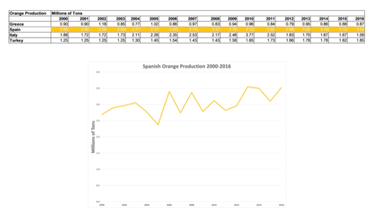
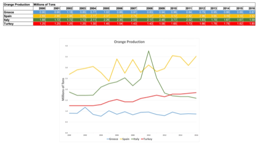
We can show production of crops over a series of years:
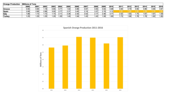
The columns are numerical rather than categorical! If we were showing a lot of years or years that aren’t spaced apart evenly, use a line chart:
Rules
- Start charts at zero
- If the labels of the categories are long, use a bar chart
-
Sort items by value rather than name
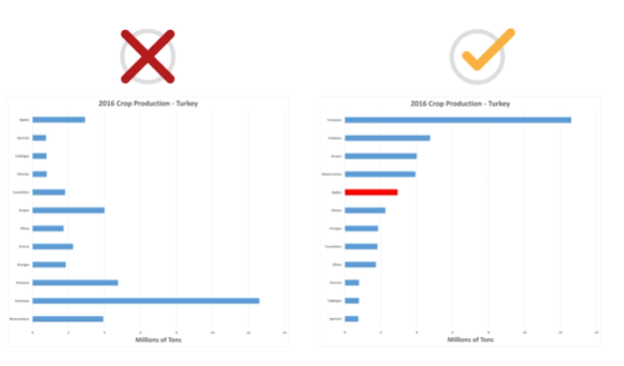
- Time based data should be horizontal, continuous, and run from left to right
Tableau Terminology
- Dimension vs Measure
- Dimensional Data: categorical data and ordinal data that are not numerical, axis on charts
- Measure Data: numerical and suitable for use in calculations
- Aggregations
- Some calculation is performed over all records that match a dimension
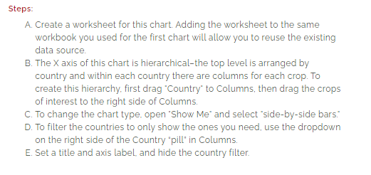
Create a Comparison Chart
Bar Chart
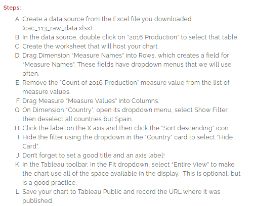
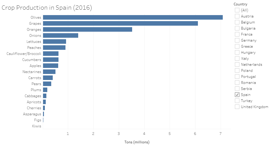 https://public.tableau.com/app/profile/annette.lopez2690/viz/CropProductionBarChart_16318334068440/Sheet1?publish=yes
Grouped Bar Chart
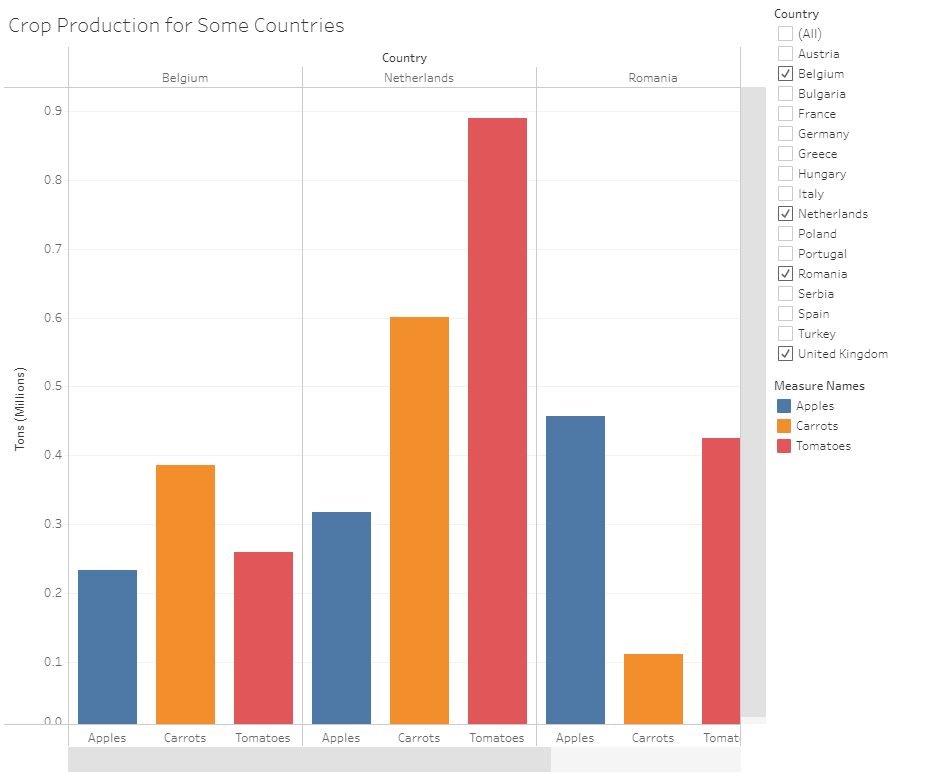
https://public.tableau.com/app/profile/annette.lopez2690/viz/CropProductionSidebySideBarChart/Sheet2?publish=yes